Predator-Prey Population graphs.
For all of the following predator-prey graphs,
the discrete version of the Lotka-Volterra model equations were used,
where we set a = .05, b = .001,
c = .0002, d = .03. The only changes between the graphs are the starting populations of the predator and the prey.
The following graphs are presented to get a better understanding of how much on an impact like the initial population has on the future, even 400 generations later.
The first
graph starts with the prey population growth in total isolation.
Next is the predator population model without the prey. Then we
consider what happens when the two species interact. Within
interaction graphs, we start with equal numbers of predators and prey,
then we give the predators an advantage by having their initial
population be higher than the prey population since the predator growth
rate is slow. Finally, the prey population is started with a
higher initial population to counteract the decrease in their population
when interacting with the predators.
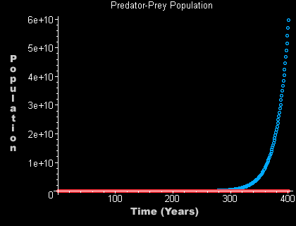
The luxuries of isolation for the prey.
This graph spans 400 years and has an initial prey
population of 200.
P1 = 200 Q1 = 0 n = 400
This graph portrays the existence of the prey without the predators. As you can see the prey
increase at a faster rate than what is probably healthy for their species.
Extinction may be the worst possible thing that could happen to any specie
but over-population is also dangerous. At this rate, the prey will
eventually be competing for food and places to sleep amongst themselves as
the prey grow unbounded. Look at the next graph to get a better feel for how time began for them.
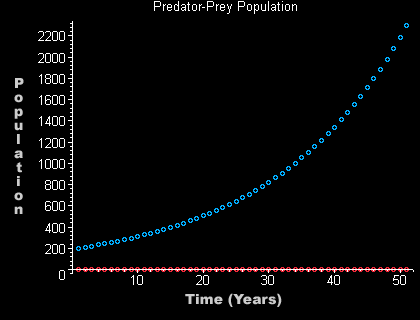
Closer look at the beginning for the prey.
This graph spans 50 years and again has an initial prey
population of 200.
P1 = 200
Q1 = 0 n = 50
Note: The only difference between this graph and the previous graph is the n. In the last one, since the prey population increased exponentially it was not obvious that the prey population had started at 200 while the predator population started at 0. This graph here, looking at only the first 50 generations, we get a zoomed in view of exactly how the two population started.
|


