|
|
||
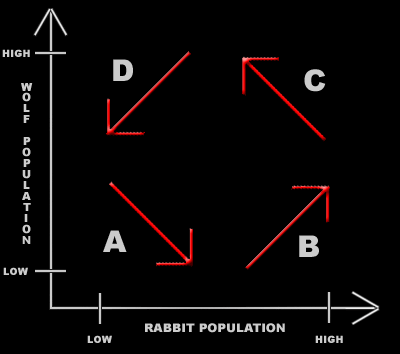
Phase Plots Instead of
looking at the two population separately in relation to time, we can also view
the predator population against the prey population. The predators looked at here will be the wolves (on the y-axis) and the preys will be rabbits (on the x-axis). The starting assumption is both the wolf and rabbit populations start low. Due to the rate that predators and prey reproduce, as shown in region A, the population of the rabbit increases and the population of the wolf decreases. Region B shows the population of the wolf growing as the rabbits' increase. Then in region C, since the wolf population increases, the rabbit's decreases. Finally, region D takes us back to the beginning, where the wolves decrease in number as the rabbits die off.
|

|
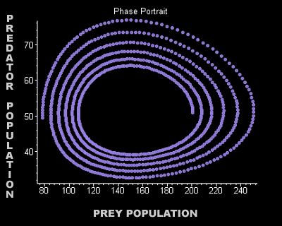
The graph below is a phase portrait. These points of view of how the population cycles around the equilibrium point may help one understand the idea behind the Lotka-Volterra predator-prey model. The following graph was produced in Maple using the predator-prey model equations. The predators begin at 50 and the prey, at 200. In the 400 generations given, the predator population is just below 50 with the prey at only 80. Look carefully at how both the graphs are displaying the exact same things.
 |
Intro Pred-Prey Graphs Phase Plots Equilibrium Points Conclusion&Error