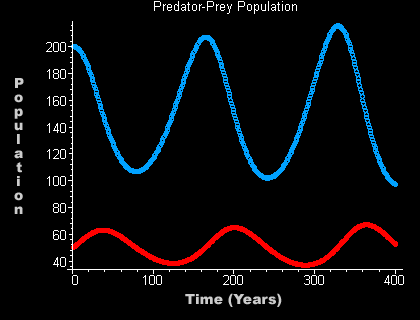
Predator-Prey Population graphs Cont'd.
Being consumed, start higher.
This graph spans 400 years, has an initial prey
population of 200 and an initial predator population of 50.
P1 = 200
Q1 = 50 n = 400
Of all the graphs presented here, this is definitely the most ideal. There is a steady wave of both the predators and the prey. Most important, neither groups ever become extinct (at least not if this pattern continues). The prey decreases as the predators consume them and predators decrease as they run out of prey to prey on. This pattern is healthy and successful for both groups. This graph shows that since the prey are being consumed at such a high rate, it is important for them to start with a high number. It is also important to not have too many predators to kill off all the prey. There is a balance here that allows both species to live
not so peaceful but happy lives.
|